These are some of the most important visual codes I will take into account when designing the cover of my magazine.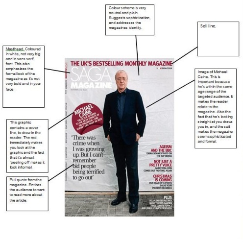
Visual Codes
•November 30, 2012 • Leave a CommentDouble Page Spread Textual Analysis
•November 30, 2012 • Leave a Comment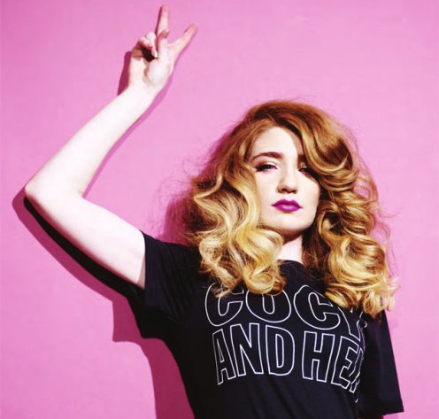
Double Page Spread Textual Analysis
The magazine I have chosen to analyse and base my own production around is ‘Notion’. The double page spread is an in-depth article and interview about the cover girl ‘Nicola Roberts’.
The spread is very similar to the cover of the magazine due to the fact that the colour scheme is exactly the same therefore representing the house style of the magazine. The only colour on the page is the image off Nicola herself with the rest of the article in monochrome attire. The image also takes up more than a whole page with a segment of it overlaying the next page. This instantly identifies the celebrity as the most important element to the article and immediately grabs the attention of the audience due to the large-ness and bold choice of colour. Looking in detail at the image, Nicola is leaning casually against a pink wall with one hand gesturing a peace sign. This could imply not only that Nicola is quite a laid-back free spirited person, but that the magazine as a whole is also non-conformist with the further implication that the readers are as well. Nicola is also fashioning the pink lipstick, dip-dyed hair and quirky choice of clothing. This ties in with the cover, but also connotes the quirkiness of the magazine. The image has also been predominantly manipulated, with Nicola’s skin looking flawless and colour has been enhanced. This gives the reader the impression that Nicola is an image of perfection and will potentially make readers aspire to be like that. Lastly, the image itself has been shot from a slight low angle at a medium shot range. This intensifies the ideology of Nicola symbolising a level of importance because the low angle typically connotes the superiority of what’s in the frame.
The general layout of the article is very sophisticated and conservative with the columns of text laid out in three vertical sections, a pull-quote from within the article displayed bigger and bolder within the main text and a title at the top. All of the body copy apart from the title is in serif font with wide guttering & kerning. This represents the overall house style of the magazine and makes it easier for the reader to distinguish the layout of the text and makes it easier to read. The text is coloured in a dark-grey with the pull-quote and title in black. This instantly points out to the reader what piece of text is more important, and gives them a taste of what is in the article. The quote from within the article has very obviously been used due to the connotation of the mode of address. The quote contains a semantic field of quirkiness due to the words like ‘weirder’ and ‘risky’ which represents the non-conformist genre of the magazine. Furthermore, the quote is something that Nicola herself is saying with a direct mode off address used ‘Maybe I’m into weirder things. If that’s what you like, that’s what you like’ and ‘Do you think that beat of my drum was a risk?’. The use of this direct mode of address and use of rhetorical questions instantly engages the reader as if Nicola is directly talking to them, and entices them to want to read on.
The title of the double page spread represents an interesting connotation, due to the fact that in most magazines, the masthead/title is usually substantially big and in-your-face. However, the title in this magazine is very small, placed in the top left corner and in sans-serif font. This could be interpreted that the magazine doesn’t want to stick to the typical conventions of a magazine but could also suggest that there’s some level of expectation towards the reader; that they don’t need a flashy title because Nicola is already a symbol of importance.

Interview Transcript about my magazine
•November 29, 2012 • Leave a CommentInterview Transcript about my cover
This is the transcript for an interview I did with a girl named Becky aged 19 about her thoughts on my magazine cover. I chose to interview her because she is within the target audience for my magazine.
Me: What do you like most about my magazine cover?
Becky: I most liked the title of the magazine. I thought it looked very elegant and original and drew my attention straight away.
Me: What advice/constructive criticism (if any) would you give me?
Becky: I really liked the magazine cover but I would say maybe the image used on the cover should have higher key lighting so that the model stands out more, rather than the background and over lighting looking distilled.
Me: Oh yeah, I see what you mean; I’ll bear that in mind next time, thank you.
Me: What did you think of the pictures of the model I used on the cover?
Becky: I thought they were fantastic, they looked very professional and the model really suited the genre of the magazine as well as her outfit and make-up.
Me: How did you feel about the colour scheme I used?
Becky: I thought the colour scheme really worked because it really fits with the gothic and edgy style of the magazine. I especially liked how the colour wasn’t primarily black and white but it had a cool blue tinge to it with the red banner standing out completely.
Me: Do you think the magazine name was appropriate and effective?
Becky: I really liked it. Rage sounds quite catchy but assertive and fierce as well, so I thought it really mixed in well with the context of the magazine.
Me: What did you think of the celebrities and designers I decided to include on my magazine?
Becky: Well I don’t really like Kristen Stewart but I can see why you chose her because she’s very relevant at the moment and she’s quite quirky and punky. However, I do like all the others especially Lady Gaga. She’s my favourite artist.
Me: Do you think the price I set is too high?
Becky: No, I think its quite reasonable considering similar magazines, and magazines I buy are usually above three pounds sometimes over four pounds.
Me: Lastly, if I were to re-create the magazine or design another one, what would you suggest I change or do differently?
Becky: Hmmm, I think that maybe you should include more cover lines or a quote from inside the magazine. Because I know when I buy a magazine, when there’s something interesting a celebrity has said or done and it tells you on the cover it makes me eager to want to know the full story.
Me: Great, thank you. One last question, would you buy the magazine?
Yes I would, it includes all the things I love and it’s cheaper than the one I buy at the moment.
Me: Ok, well thank you for your feedback. It was nice hearing your compliments and advice.
Becky: No problem, my pleasure.
Magazine Publishing
•November 28, 2012 • Leave a CommentThe magazine I am basing my research on is ‘Notion’ magazine (originally klub knowledge) that runs monthly. It is published by Music HQ Media.
Music HQ Media is a small publishers based in London which has Notion as its only print based media product. The magazine and its publisher are somewhat brothers, with one being the retailer and the other the distributor. Despite being an independent publisher ‘Music HQ Media’ has enjoyed success just by selling Notion. It not only offers the magazine in print (with a circulation of 25,000 units) but also as a digital product.
One of the biggest publishers in the UK is IPC Media. With magazines ranging from women’s weekly magazines to gardening for ameutures. “With more than 60 iconic media brands, IPC creates content for multiple platforms, across print, online, mobile, tablets and events. As the UK’s leading consumer magazine publisher we engage with 26m UK adults – almost two thirds of UK women and 42% of UK men. Our award winning portfolio of websites reaches over 25 million users globally every month.” This quote proves that IPC are one of the biggest publishers out there at the moment. They not only cater to men and women but they also cater for the people who prefer digital media to print based media.
The worldwide and UK publishing industry certainly in the last couple of years have introduced a more modern way to get their product out to the consumer, whether that’s via print or digital format. We can see that most publishers in today’s society have a balance between the two. Therefore maybe it isn’t a question on whether we have to decide between digital or print, but more of an open selection that we (the consumer) have the opportunity to diverse in whatever we may prefer. Linking back to the independent publisher of my magazine ‘notion’ we can also see that they also offer their print based product as well as digital product with both earning a more than satisfactory success. So to conclude, the best way for a publisher to sell their magazine (no matter how big and successful) is to offer the consumer a choice in whether they want to purchase the product digitally or print-based rather than sticking to one or the other.

Front Cover textual analysis
•November 26, 2012 • Leave a CommentMagazine Front Cover Textual analysis

The magazine I have decided to base my analysis on is ‘Notion’. I have chosen this magazine because it doesn’t stick to a particular magazine genre; it branches out the use of hybridity and gives us a slice of music, fashion, culture and lifestyle, which is what I want my magazine to be associated with. The magazines target audience is for 18-30 year olds who have an interest in the genres listed above.
To begin, the layout of the front cover is quite conventional considering the masthead is the biggest text on the cover, the model is placed in a central position and the cover lines are dotted around the central image. Moreover, the masthead of the magazine is not only placed at a central top position but it is also slightly obscured by the image of Nicola. This is a typical convention a whole variety of magazines used, as it is important in building a house style for that specific magazine. It not only implies that the magazine is slightly informal and edgy, but it also assumes that the readership of the magazine is already familiar with the house style of this magazine. This is important because it makes the magazine seem more iconic and already known by many readers, but it also makes it easier for people to recognise the house style of the magazine amongst the cluster of other magazines accumulated on a retail shelf. Furthermore, the font (as well as the rest of the magazine) is coloured plainly in black against a white background. The use of this monochrome colour scheme implies that the magazine is quite sophisticated. However, the only colour used on the cover is the name of the model and the model herself. This can be interpreted in many ways. The first being that it implies that the model ‘Nicola’ is the most important feature on the magazine and due to the bold use of colour that is used within the mise en scene of her image it signifies a level of importance and boldness. Secondly, looking into the nature of the magazine, notion prides itself upon being a magazine that conveys themes of ambiguity and duality. Similarly, the contrast in the colour scheme of the magazine and the colour of the central image being totally incomparable intensifies these themes.
Moreover, the typography used within the masthead is in serif font. This has been used because it is proven that on print based media; serif fonts are more easily readable as the letters are more distinctive and easily identified. Also the sleek style of the font implies that the nature of the magazine is also quite chic and exquisite also.
Additionally, the connotation of the word ‘notion’ is completely relevant to the contrasting nature explored within the magazine because it means to have a vague idea/conception and it is a synonym of belief, view and opinion. This is highly imperative to the magazine because it sets the tone and symbolises the ambiguity explored throughout.
The magazines secondary piece of text is placed on the centre of the page. ‘Make your heart go wow’ this mode of address immediately grabs the audience because it speaks directly to the reader ‘your’. It also employs the use of imperative and gives good example of hyperbole due to the fact that it suggests a sense of urgency in what the statement is saying. The use of the exclamation mark and connotation of the word ‘wow’ makes the statement appear more dramatic/exciting and entices the reader to want to know more.
In addition, the phrase is in sans serif font and the word ‘wow’ is just as big as the masthead with wide kerning. This intensifies this sense of urgency and makes the phrase seem bolder and more conspicuous.
The image used on the front cover is of singer Nicola Roberts. This already implores an inherited audience of any fan of hers but it could also signify the target audience of the magazine; young, female and stylish. Furthermore, Nicolas body language ties in with the ambiguous and mysterious theme explored in the magazine because she’s holding her hands over her face with an open mouth and smouldering eyes. This connotes not only a sense of mystery and secrecy but it could also be linked to the phrase placed underneath her because she also looks shocked which ties in with the lexis and urgency used in the cover line.
Nicola is also wearing a sleek looking pink dress and pink lips. This connotes playfulness and sophistication, which could be relevant to the audience of the magazine. She also has dip-dyed hair which is a massive trend amongst young girls in todays society. This not only tells us about the model herself but it also implies that the magazine as a whole is current, fashionable and trendy.

How Do Magazines Attract Their Audience
•November 8, 2012 • Leave a CommentHow Do Magazines Attract Their Audience
Magazines attract their audiences using several different methods; the main thing that attracts a certain audience is the Masthead and the sell-line. These two things are vital in magazine publishing because the title Sais a lot about the magazine and is usually what people will look at first. In my case my magazine is called ‘Q’ and the sell line is ‘Discover Great Music’ which is simple yet effective. This immediately tells the audience who the magazine is for (music lovers) and what the magazine is about.
The colour scheme also has a vital part to play in attracting an audience, for example: If the magazine is about fashion and gossip the magazine will use feminine colours, such as pink and yellow, and will usually be bright and attention grabbing. This is because these colours appeal to the audience of young women because they look friendly and girly. However, on my magazine the colours used are mostly quite neutral using reds, yellows and white. This suggests that the magazine is catered for both genders, as they’re neither feminine nor masculine and could also suggest that the magazine is for a more sophisticated reader. Furthermore, the font used on my magazine ranges from sans font, Sans serif and handwriting font that’s quite scruffy. This suggests that the magazine is still quite sophisticated but also edgy. The connotation of this could be that scruffy font is quite Rock and Roll, which could attract this type of audience.
Another Key element that magazines use to attract their audience is the cover lines splashed on the front cover and the house style. On my magazine, the cover lines all include something to do with music such as ’50 albums of the year’. This clearly tells the audience; who the magazine is for and the magazines identity.
The main image used on a cover is also vital to the Identity of the magazine. In my case, the image is of Chris Martin from Coldplay in an almost Rock and Roll pose. This is very important to attracting a certain audience and suggests that the magazine is catered to people within the same age range as Chris Martin. The pose emphasizes the edginess I mentioned earlier, and the fact the he’s from an alternative rock band clearly states this.